Mental Models, Online Learners and Broken Escalators
June 2022 - Matt Edwards
When designing a great user experience, we need to understand the mental models that our users bring with them.
Why do broken escalators feel so strange?
So why do broken escalators feel so strange and weird? You will always find a queue of people all very slowly and gingerly stepping on and then slowly making their way up. Unfortunately, this is a regular occurrence at Birmingham New Street Station, but the experience always remains strange and unnatural. Essentially the escalators have just turned into a set of stairs like any other. So why does it feel so weird?... that's because our mental model of how an escalator should be used has been broken.
Definition of mental models
So what is a mental model? Over time we have all built up a model of how the world works and these have been based around our own personal experiences and assumptions. We then take these with us into new experiences.
The definition of a mental model by Nielson Group is "What the user believes about the system in hand". A mental model is based on belief, not facts: that is, it's a model of what users know (or think they know) about a system such as your website or a Virtual Learning Environment (VLE).
Incorporating mental models into a VLE
As individuals, we all have our own mental models. But there are experiences that a large percentage of users have shared or have a basic assumption of before engaging. For example, we have a common understanding of how to complete online e-commerce transactions. Online booking systems. Navigate around news websites. Engage with social media platforms and so on.
When designing within new platforms that a user has very little or no experience with (such as a VLE) we need to utilise these shared mental models. This can be split into two main categories.
- Funtionality: Users will come into a VLE with a mental model of past online experiences. As mentioned above... e-commerce, social media, online bookings etc. We need to utilise this and incorporate these elements into our designs. This doesn't mean creating a mish-mash of various user interface designs but instead taking a subtle nod to what a user would expect and what already feels natural and free-flowing. This alongside design psychology and usability best practices helps create an environment that appears familiar.
- Cosmetics: Users will also bring a mental model with them of the institution's optics, brand and feel. They would have experienced this through previous touch points on their journey. Promotional printed material, events, online digital media and face-to-face contact all contribute to this mental model. Should Apple or Virgin launch a new product tomorrow, I bet you would already have a mental model of what the overall branding, look and feel would incorporate. This is the same expectation a user would have when engaging with an educational institution and within its chosen online learning platform.

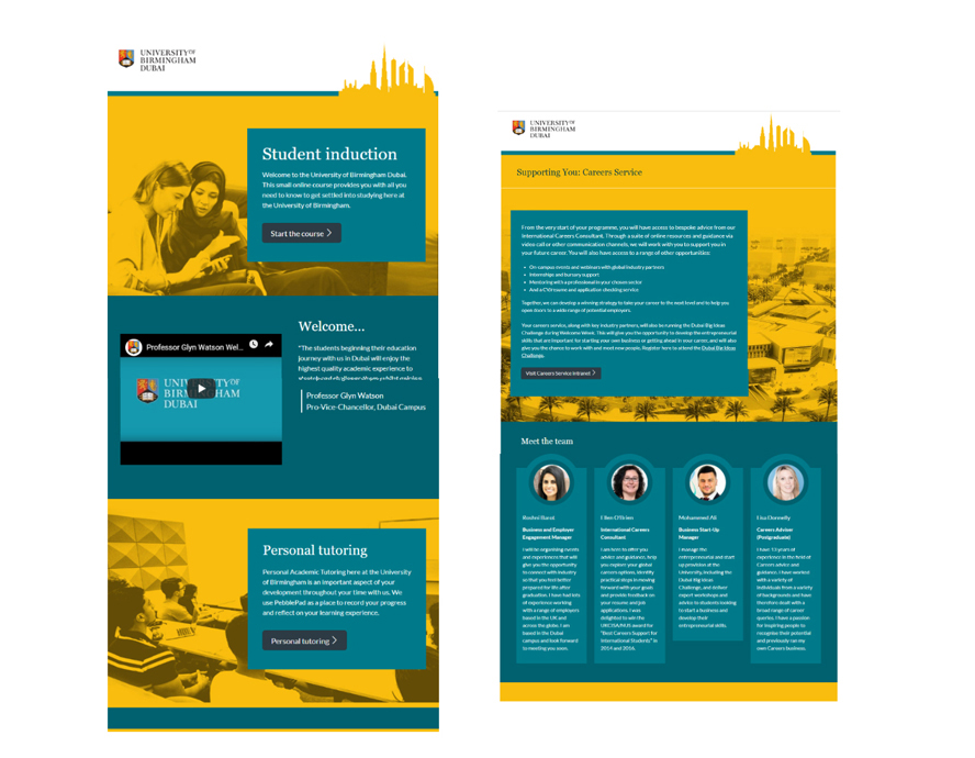
1: Various touch points a student would have encountered with the University of Birmingham Dubai (signage, wayfinding, printed materials, digital advertising, events). A 'cosmetics' mental model has already been created.

2: The users mental model is now brought forward into the online learning experience. Establishing a natural and free-flowing journey
Why bother?
So why bother? Why not just create what we want. Different layouts, different colours, differing terminology? Because users are more at ease with tasks or experiences that feel familiar. A lack of consistency will increase cognitive load as users have to think more about layouts and naming conventions. All experiences that we enjoy and remember are the ones that feel natural and are free-flowing. WE DON'T LIKE TO THINK! Reducing users' cognitive load is a key component to creating a successful online learning experience, and understanding users' mental models play a huge part in delivering this.