Why Tom Hanks IS The Best UX Designer... Ever!
Ahead of his time by nearly 30 years. The design community were decades away from the title UX (User Experience) Designer, and yet Mr Hanks was already walking the walk, talking the talk and leading from the front.
I sat and watched a film which I hadn’t seen in many years. It was a favourite from my childhood, and as I sat back and reminisced I realised Tom Hanks was truly decades ahead of his time. In my day to day job as a UX and Learning Designer, I was incorporating and used many of the techniques that Tom had already demonstrated back in 1988.
Ahead of his time
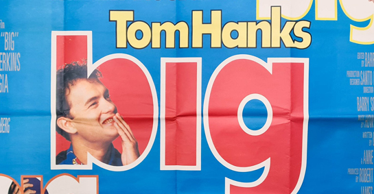
The film I’m referring to is the classic 1980’s film ‘Big’. For those who have not watched ‘Big’ firstly shame on you. Secondly, watch it and watch it with a notebook and pen alongside you. Any uncertainties or doubts you may have about adopting a User Experience approach and putting your users first is put to rest through watching this film. For those who have not yet watched the film, the official description goes...

“At a carnival, young Josh Baskin (Hanks) wishes he was big – only to awake the next morning and discover he is! With the help of his friend Billy (Jared Rushton), Josh lands a job at a toy company. There, his inner wisdom enables him to successfully predict what children want to buy, making the awestruck, naive Josh irresistible to a beautiful ladder-climbing colleague (Elizabeth Perkins). But the more he experiences being an adult, the more Josh longs for the simple joys of childhood.”
In essence, Tom is a 12-year-old living in the body of an adult. He gets a job at a toy company and quickly starts turning its outlook and profits around. Gaining direct insight and feedback from its users (Tom) the toys are re-designed and marketed through the eyes and experiences of its actual users.
Aligning to Mr Hanks
In September and October of this year, I was fortunate to be invited to present at InstrucureCon 2021 and Canvas Caravan UKI. My presentation was titled ‘A UX First Approach To Online Distance Learning‘ (you can view this at 24.48mins). A section of my presentation briefly included ‘What is UX design?’ in which I listed 3 areas. When you watch ‘Big’ you can instantly see how Tom aligns to these 3 areas…
- Remove any friction and confusion that stands between your customers and their end goals.
- UX design is not just confined to the digital world. Encompasses all customer touch points.
- Putting the end-user first and working backwards.
I don't get it?
When re-watching ‘Big’ I also came across a great scene which also feeds so well into UX and Learning Design. It’s a blog post that I have previously written about in regards to constantly asking questions and being the ‘why?’ person in the room. It’s by doing this that we can drill down to the best results, products and experiences for our users.
Take away point
In my presentation I linked to earlier, I talk about putting the end-user first and working backwards. Standing in their shoes, looking through the eyes of our users, and understanding their emotions and feelings whilst engaging with our product or learning experience. ‘Big’ approaches and addresses all this but in a much more entertaining way. So download or buy the DVD, sit back for 2 hours and enjoy Mr Hanks showing us a UX first approach.